Sharp on every screen, not just the demo.
Every page tested and tuned for phones, tablets, and desktops — because that’s where your visitors actually are.
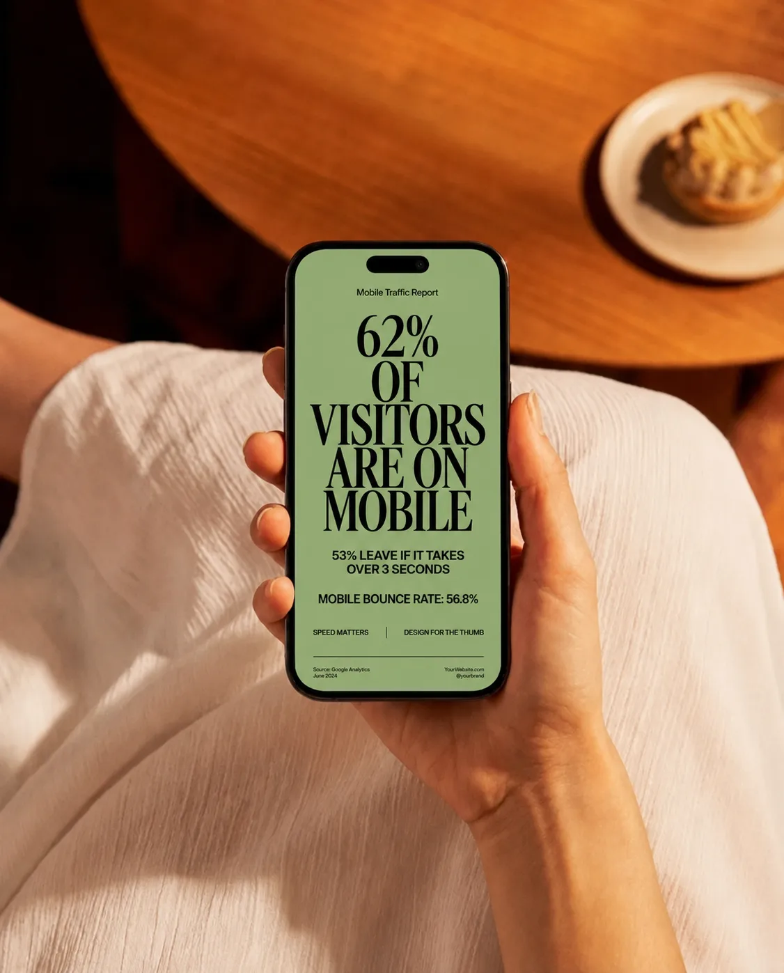
Most of your visitors show up on a phone. Too many sites still treat mobile as an afterthought — text you have to pinch to read, buttons you can’t tap, layouts that collapse.
A visitor who struggles on their phone doesn’t email support. They leave.
What’s included
-
Every page tested on real devices, not just a desktop preview
-
Tap targets and text sized for thumbs, not cursors
-
Layouts that adapt instead of breaking on small screens
-
Fast on mobile data, not just office wi-fi
How it works
Straight answers, no jargon.
Every site claims to. Plenty still ship layouts that fall apart at real phone sizes. We test on actual devices, not just a resized browser window.
The opposite. Mobile-friendly done right means lighter, faster pages — which helps your rankings too.
Often, yes. We audit where it breaks and repair it — no full rebuild required unless the foundation is the problem.
Great on the screen that matters most.
Every page tested and tuned for phones, tablets, and desktops — because that’s where your visitors actually are.